Colour Theory: The Power of Colour in Photography
In the realm of visual arts, colour is not just a mere attribute of an image; it’s a powerful tool that conveys emotions, sets the tone, and even influences perceptions. Photography, as a medium that captures and communicates stories, heavily relies on colour to enhance the narrative and connect with the viewer on a deeper level. The essence of colour theory lies at the heart of this transformative process, offering a framework through which photographers can harness hues and contrasts to tell stories that resonate.
What is Colour Theory?
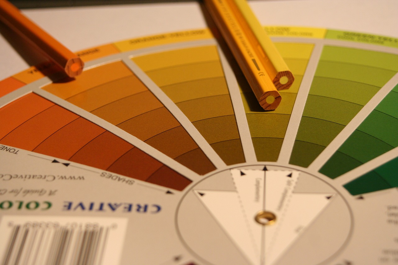
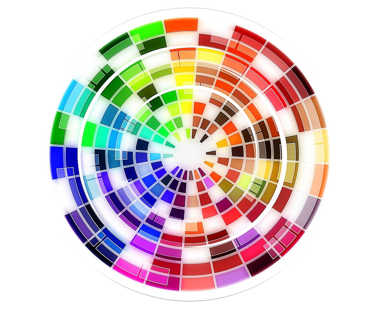
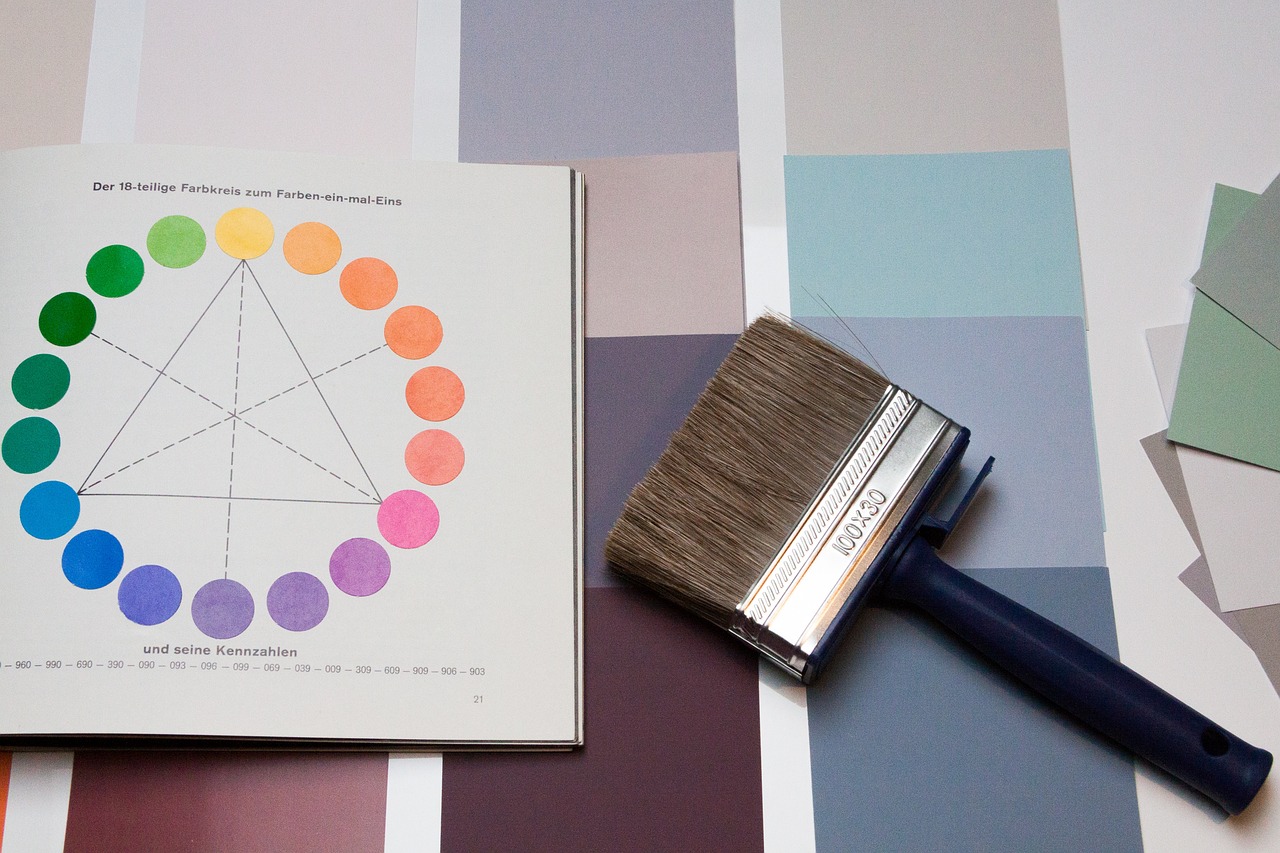
At the heart of using colour effectively lies the understanding of colour theory — a principle that guides the combination and application of colours in a way that is harmonious and pleasing to the eye. The colour theory wheel, a visual representation of colours and their relationships, is a fundamental tool for photographers. It helps in creating colour harmony through complementary (colours opposite each other on the wheel), analogous (colours next to each other on the wheel), and triadic (three colours evenly spaced on the wheel) schemes. These harmonies are crucial for achieving balance and evoking specific moods in photographs.
- Complementary Colours: Comprising two hues opposite each other on the colour wheel, such as blue and orange or red and green, complementary colours create high contrast and vibrant visuals. This scheme is excellent for making a subject stand out, offering a dynamic and attention-grabbing aesthetic. For example, a fashion photoshoot might feature a model in a bright orange dress against a deep blue backdrop, making the clothing pop and immediately drawing the viewer’s eye to the product.
- Analogous Colours: This scheme involves colours that are next to each other on the colour wheel, creating a more harmonious and cohesive look. For instance, in food photography, using a palette of warm reds, oranges, and yellows can create an inviting and appetising image of a dish, enhancing the natural colours of the ingredients and evoking a sense of warmth and comfort.
- Triadic Colours: Triadic schemes involve three colours evenly spaced around the colour wheel, such as red, yellow, and blue. This approach offers a balanced yet vibrant composition, striking a harmony between contrast and uniformity. It’s suited for images requiring a lively yet cohesive palette: A triadic scheme of red, yellow, and blue can be used to photograph children’s toys, for example, making the image lively and appealing to both kids and parents by highlighting the fun and energy of the products.
Manipulating Mood with Colour
Colours have the innate ability to evoke specific emotions and atmospheres. Warm colours like red, orange, and yellow can stimulate feelings of warmth, excitement, and energy, making them ideal for capturing moments of joy and action. In contrast, cool colours such as blue, green, and purple tend to evoke calmness, serenity, and melancholy, perfect for portraying tranquillity or sadness. Understanding colour theory psychology allows photographers to manipulate mood and convey a deeper narrative through their work. For instance, the use of subtractive colour theory, which deals with the absorption of light, can create dramatic contrasts and highlight the main subject effectively.
- Red: Passion, excitement, danger. Ideal for drawing attention or depicting intense emotions.
- Orange: Warmth, enthusiasm, creativity. Works well in lively settings or to stimulate appetite in food photography.
- Yellow: Happiness, optimism, caution. Brightens images, conveys energy, or warns when used sparingly.
- Green: Growth, health, tranquillity. Perfect for conveying a sense of renewal or peace, often used by those in the healthcare and wellness industries.
- Blue: Calm, trust, sadness. Evokes serenity or melancholy, suitable for reflective or tranquil scenes.
- Purple: Luxury, mystery, spirituality. Adds a touch of elegance or mystery, often used in fashion or conceptual photography.
- Black and White: Sophistication, timelessness, emotion. Focuses on form and contrast, highlighting the emotional depth of the subject.
Colour in Composition
Beyond evoking emotions, colour plays a crucial role in guiding the viewer’s eye through a photograph. Strategic use of colour can create focal points, balance the composition, and even lead the viewer’s journey across the image. Photographers must consider how colours interact, their intensity and saturation, and their placement within the frame to create a cohesive and impactful composition. This includes understanding why colour theory is important and how it works to enhance the visual storytelling of a photograph:
- Contrast for Emphasis: Utilising high-contrast colour pairings, such as complementary colours, can dramatically accentuate the focal point of an image. This technique is particularly effective in product photoshoots, where a product needs to stand out against its background, ensuring it captures the viewer’s immediate attention.
- Harmony for Unity: Employing analogous or monochromatic schemes imparts a cohesive and serene aesthetic to images. This approach is invaluable in fashion photography, where the goal is to create a subtle yet compelling backdrop that complements the apparel without overshadowing it.
- Balancing Colour Weight: Colours possess inherent visual “weights”; warm or vivid hues attract more attention. Balancing these with cooler or muted tones can counterbalance the composition, crucial in portrait photography to maintain focus on the subject while retaining a professional appearance.
- Guiding with Colour: Strategic colour placement can direct the viewer’s gaze through the image, establishing a narrative flow. In commercial layouts or editorial spreads, colour can lead the eye from key product features to call-to-action elements, subtly guiding the consumer journey.
- Adding Depth Through Colour: A gradient or transition from warm to cool colours can introduce depth, distinguishing subjects in the foreground against a receding backdrop. This technique enhances product showcases, adding dimensionality and making the product pop.
- Highlighting through Saturation: A splash of saturated colour against a neutral or less saturated background can underscore the main subject, a tactic often employed in food photography to make dishes appear more tantalising and flavourful.
- Setting the Scene with Colour Palettes: The chosen colour palette can significantly influence the atmosphere of an image, a concept pivotal in brand photography. Soft, pastel hues might evoke freshness and lightness suitable for skincare products, while bold, saturated colours could suggest dynamism and vitality for sports equipment.
Enhancing Visual Narratives with Colour Mastery at GradePixel
At GradePixel, our mastery over the colour palette transforms each photograph into a vivid narrative, meticulously weaving together the essence of vibrancy and subtlety. Our profound grasp of colour theory and its psychological nuances empowers us to sculpt images that do more than capture attention — they resonate deeply, invoking emotions and crafting stories that linger.
Through strategic colour manipulation, we accentuate the narrative, mood, and purpose of every campaign, ensuring that each frame is not only visually stunning but also strategically impactful. Our commitment to harnessing the transformative power of colour positions us as the ideal partner for brands looking to elevate their visual content.
Engage our professional photography services in Singapore to infuse your next photography project with depth, emotion, and vibrancy. Ensure your message is given what it deserves, and is not just seen but felt and remembered.